Course
AD 318A: Graphic Design: Typography and Layout Teaching
Typography
This typography course treats type as a system for crafting voice, mood, hierarchy, and meaning. Students build letterforms, specimen posters, packaging labels, motion graphics, publication layouts, and web interfaces while learning how typographic choices carry tone, structure, and audience.
Institution
Northern Michigan UniversityLevel
Intermediate graphic designPrimary tools
Illustrator, FontLab, Photoshop, InDesign, After Effects, HTML/CSSCourse logic
Type becomes a system for meaning.
Typography is introduced as more than communication; it is craft. Projects move from custom letterforms into branded labels, motion, and researched editorial layouts so students can make type choices that can be defended, critiqued, and revised.
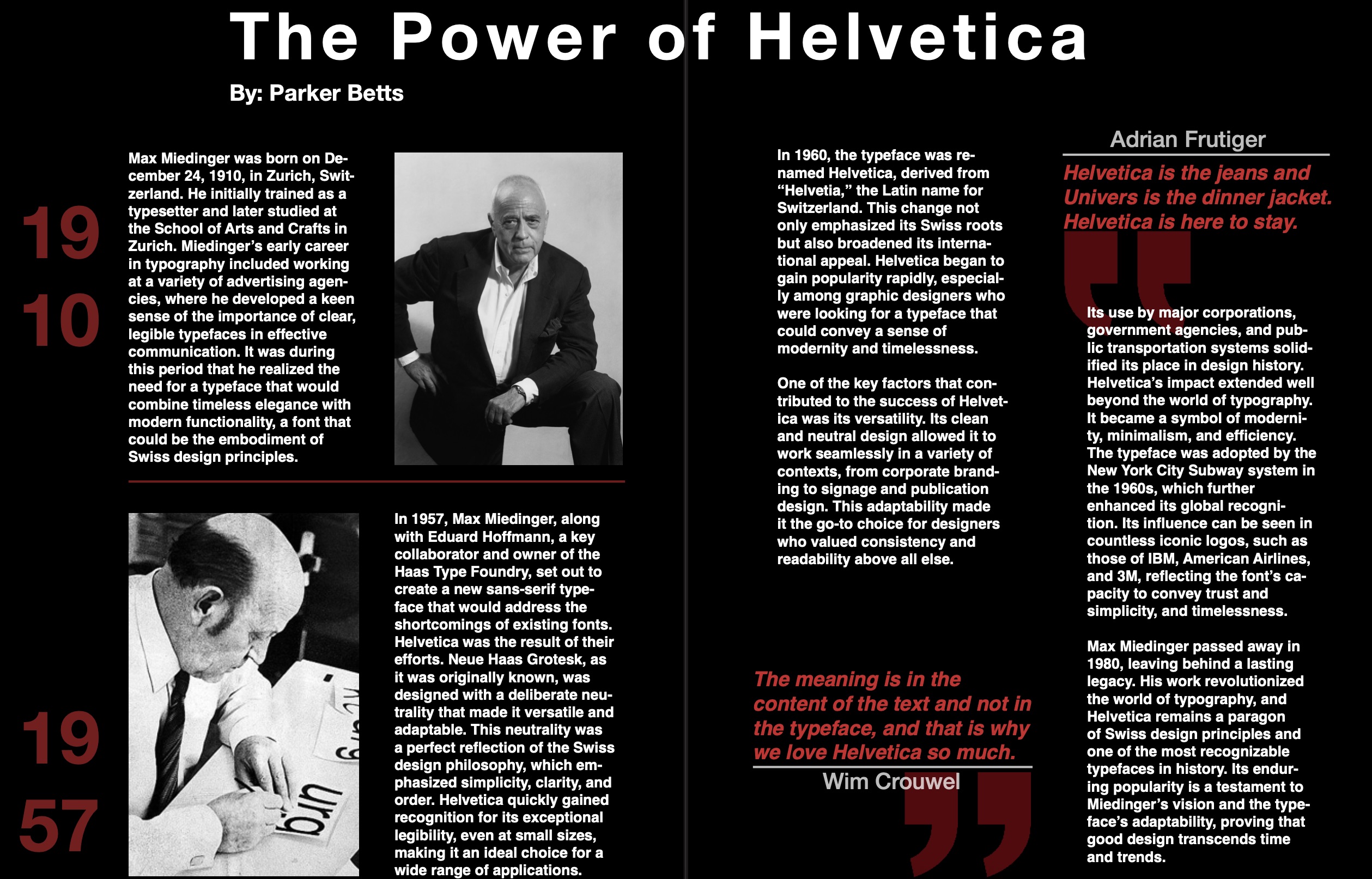
Letterform and Voice
Students build type from sketches and personal themes, then apply formal decisions so letterforms can carry tone instead of only filling space.
Hierarchy and Grid
Projects use hierarchy, pacing, and grid systems to make typographic information easier to navigate and understand.
Format and Motion
The work moves across posters, packaging, motion, and publication layouts so type is tested in static, sequential, and time-based formats.
Assignment sequence
From letterform to layout systems.
The projects ask students to design type, apply type, move type, contextualize type, and build for print and screen. Each assignment adds another format while keeping hierarchy, voice, and legibility in view.
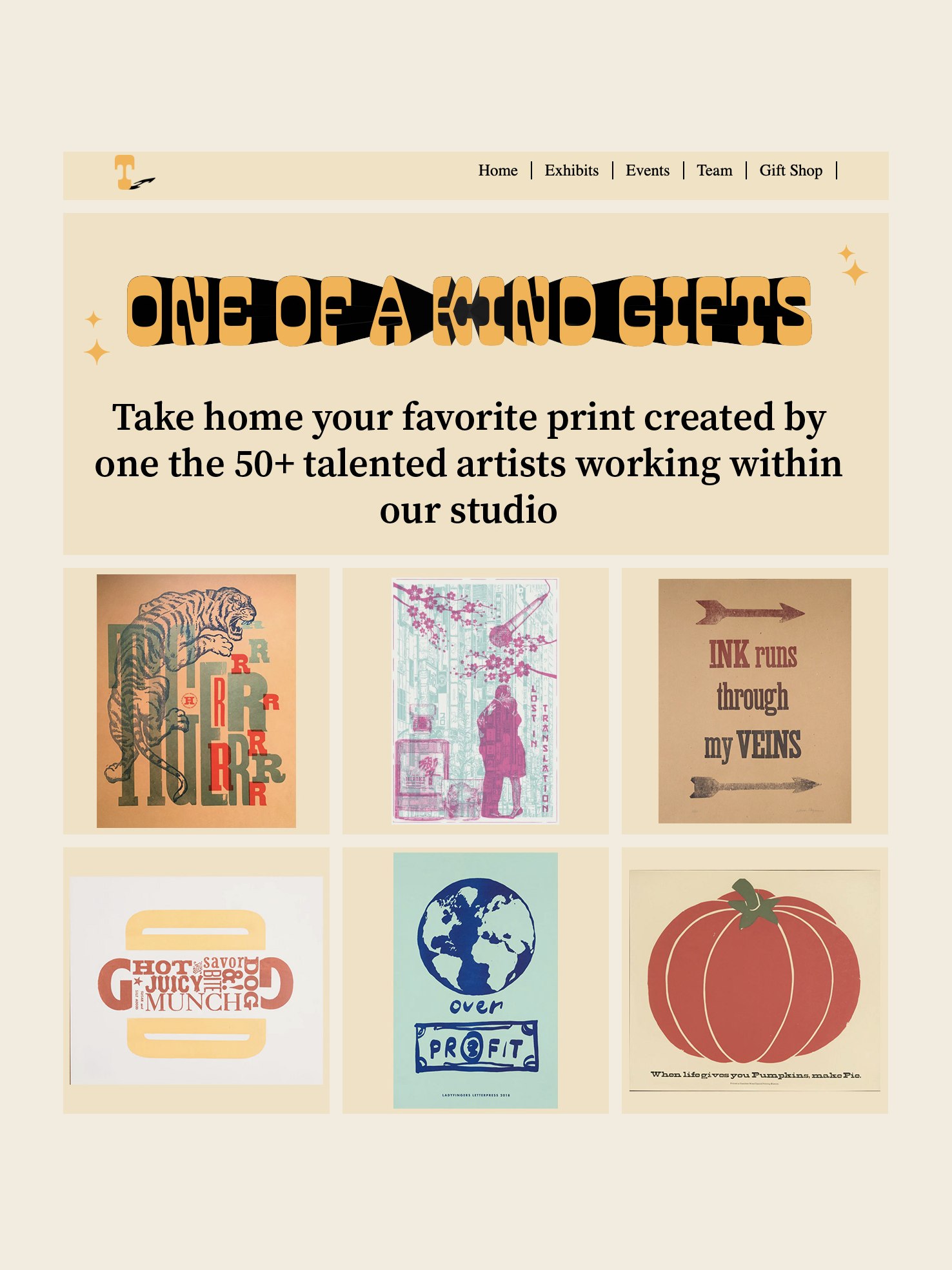
01
Letterform, theme, specimen
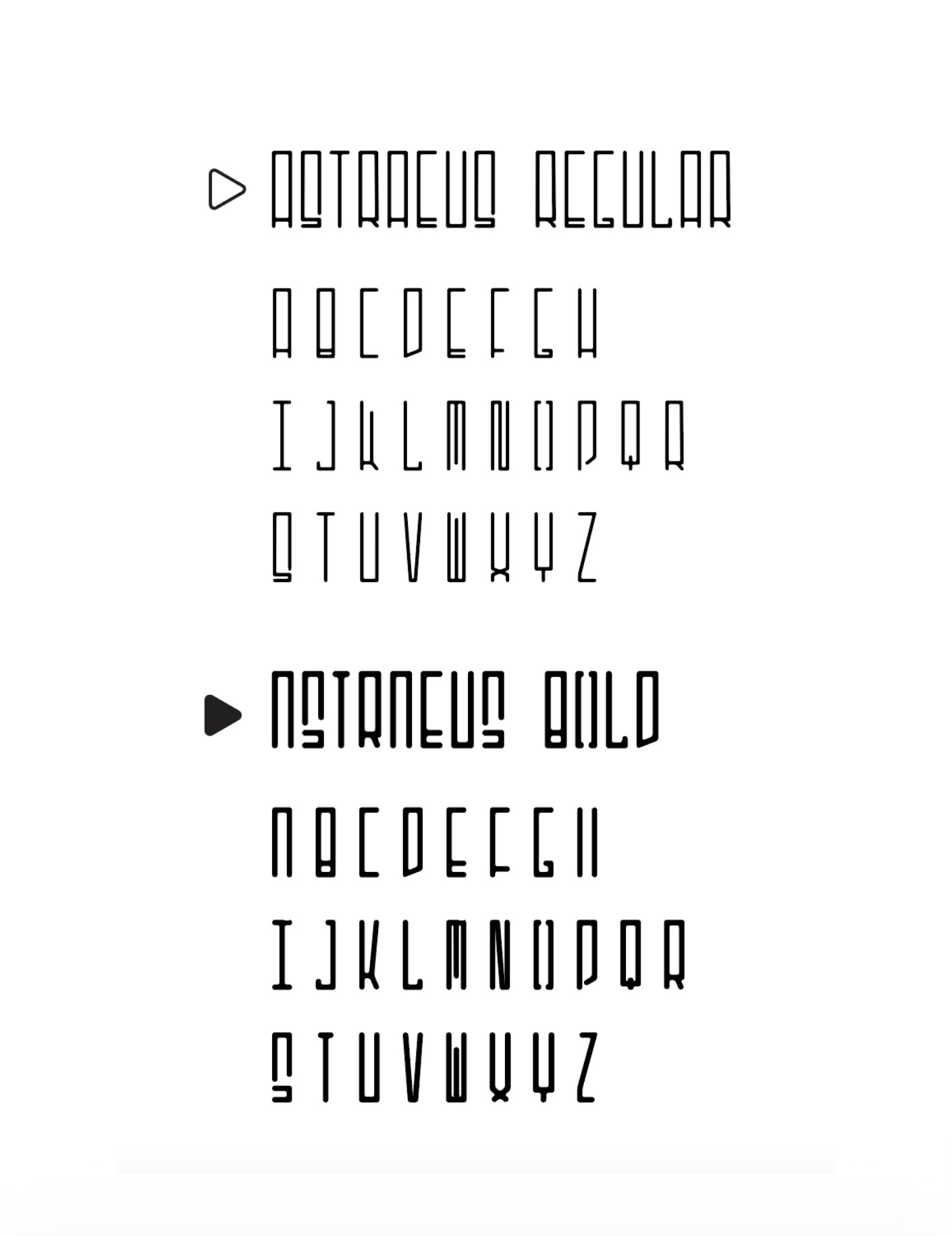
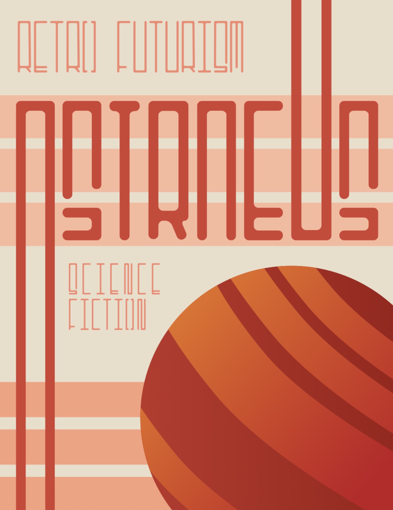
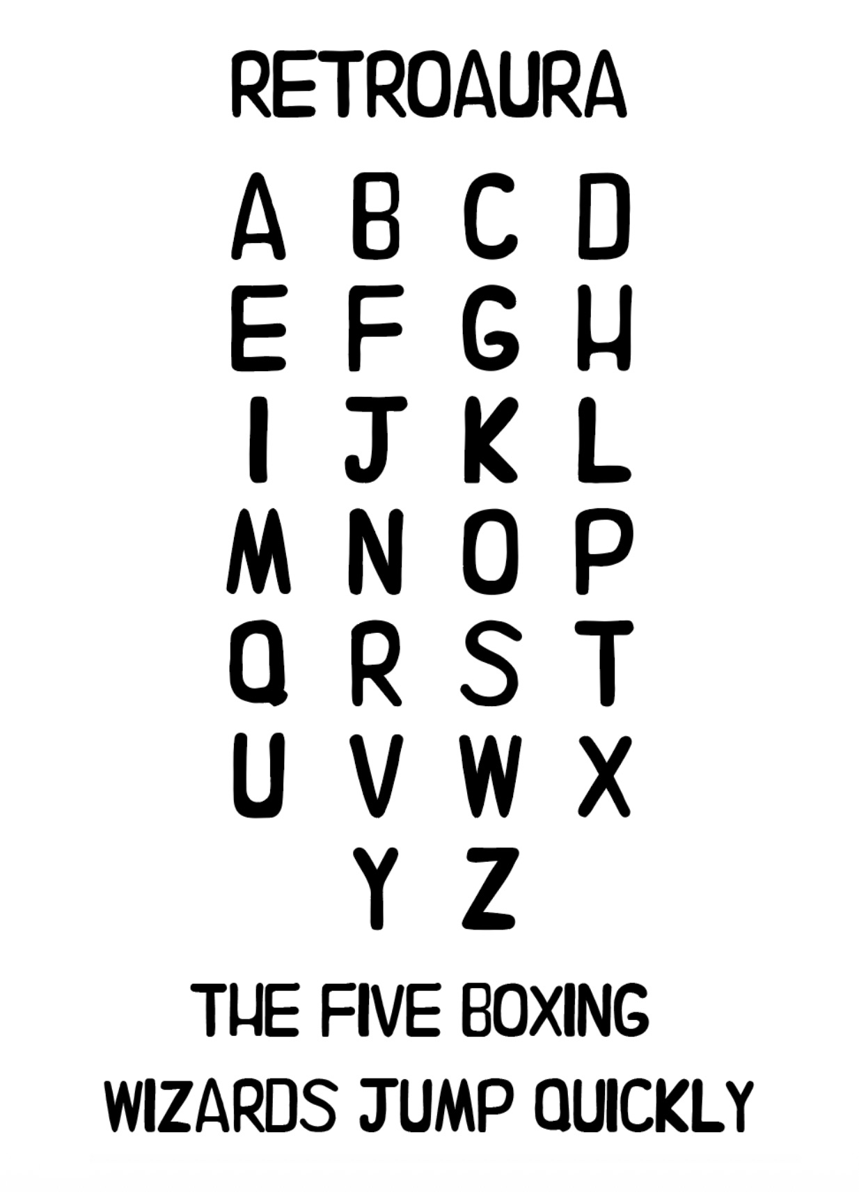
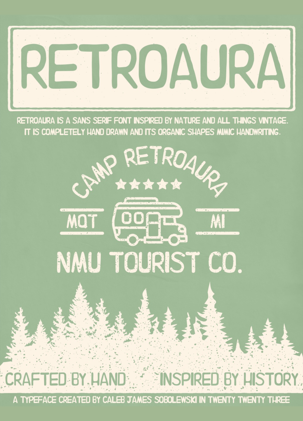
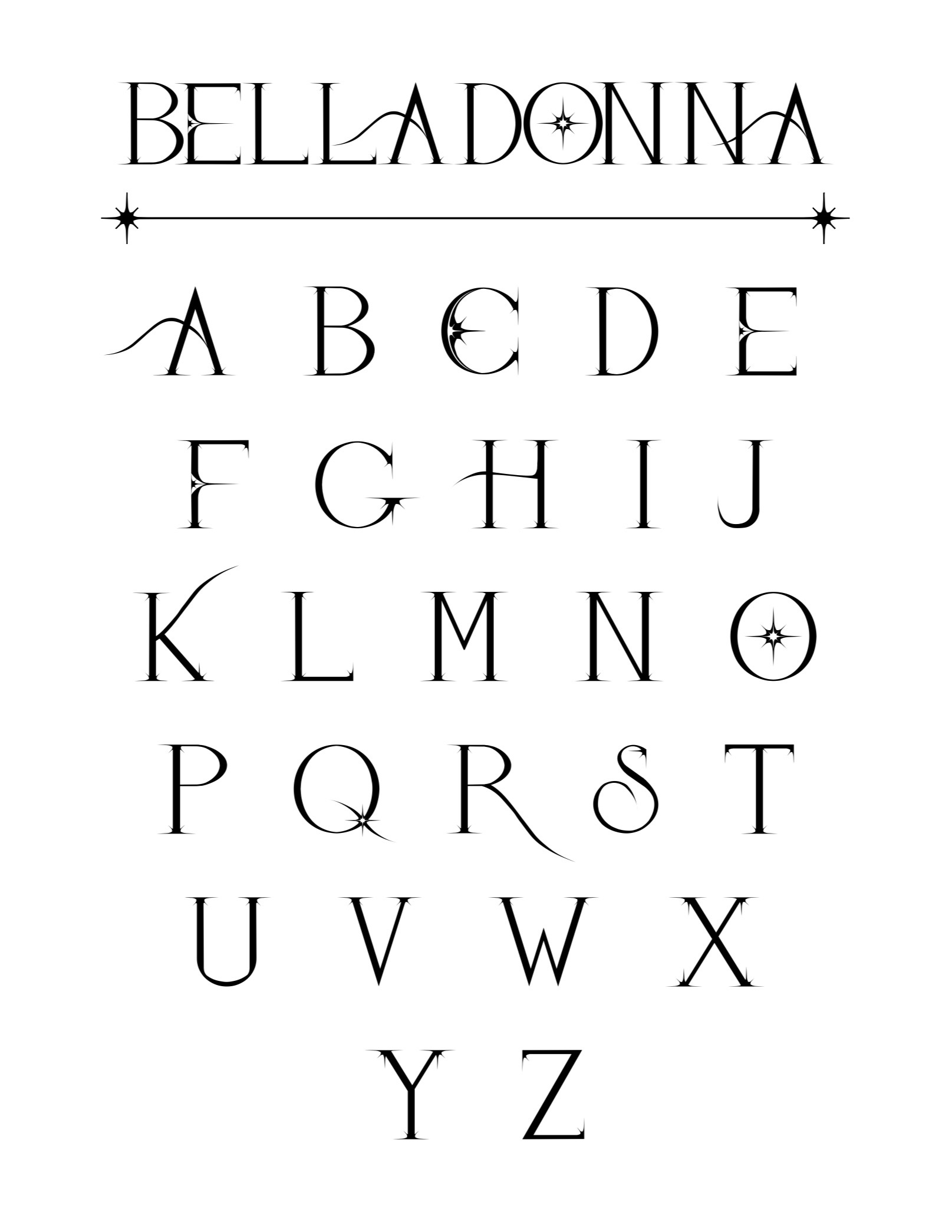
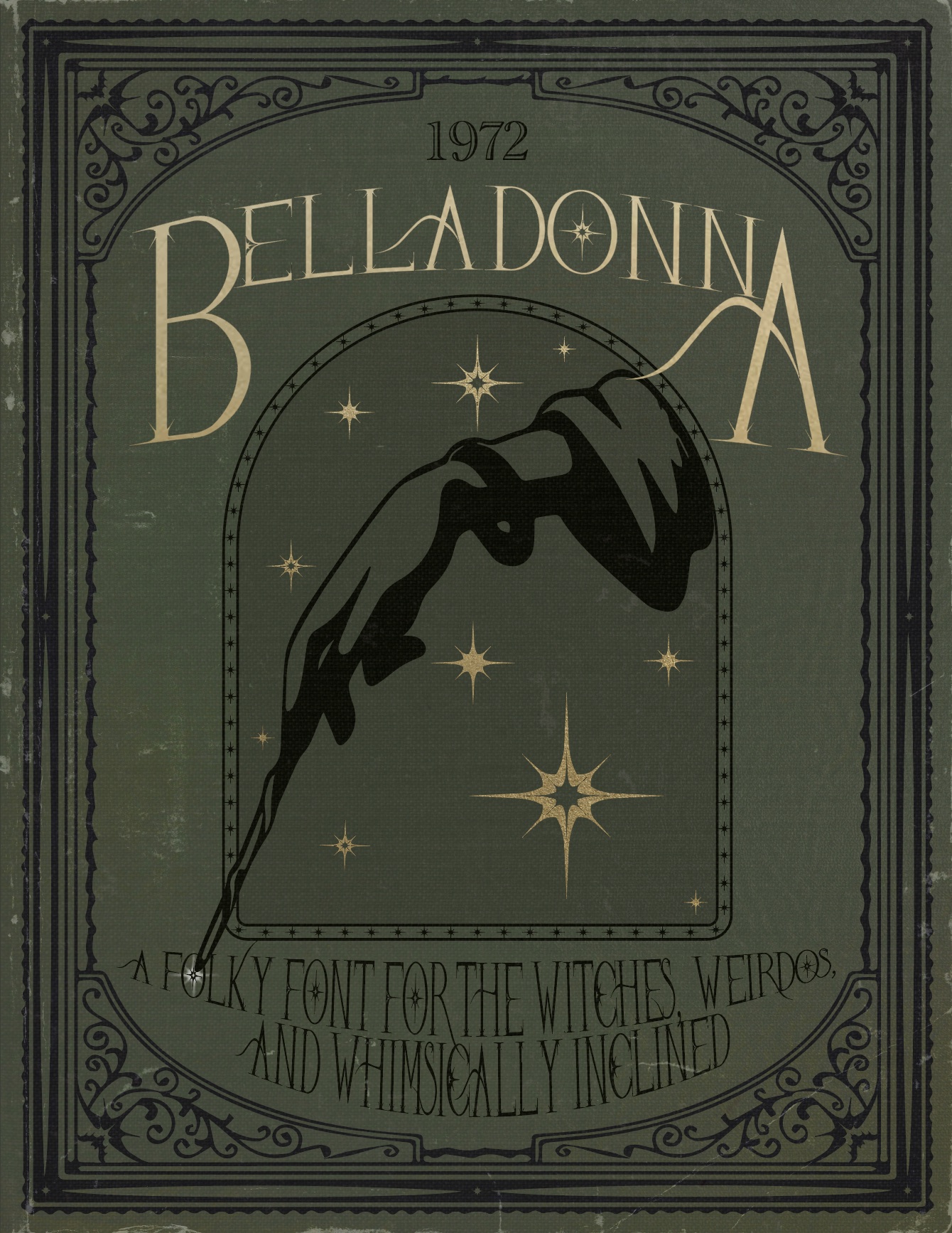
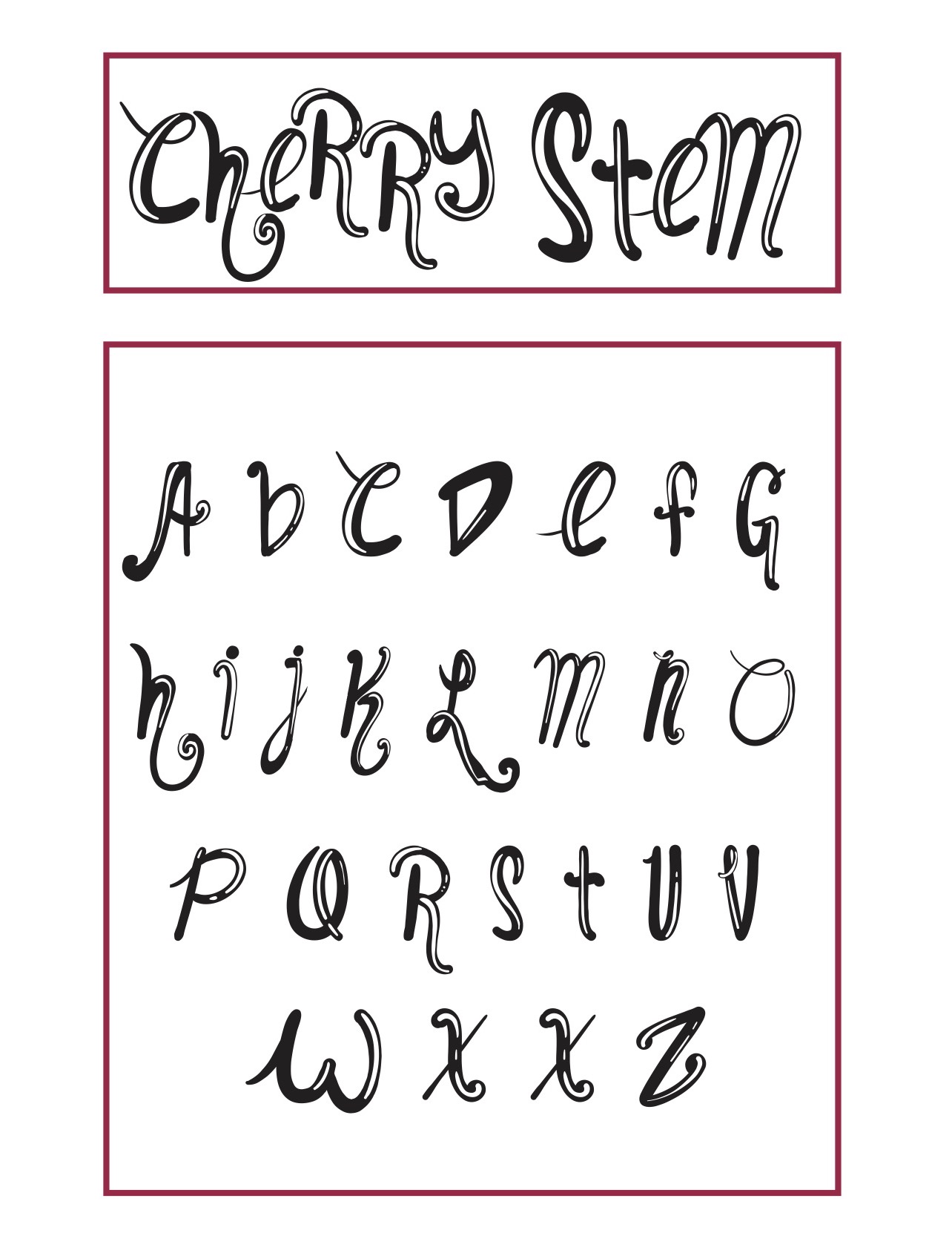
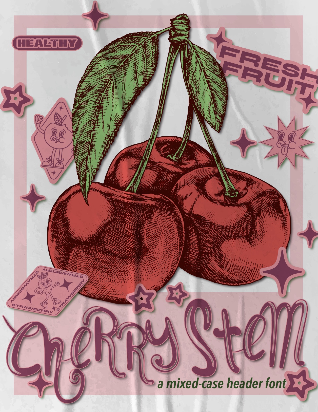
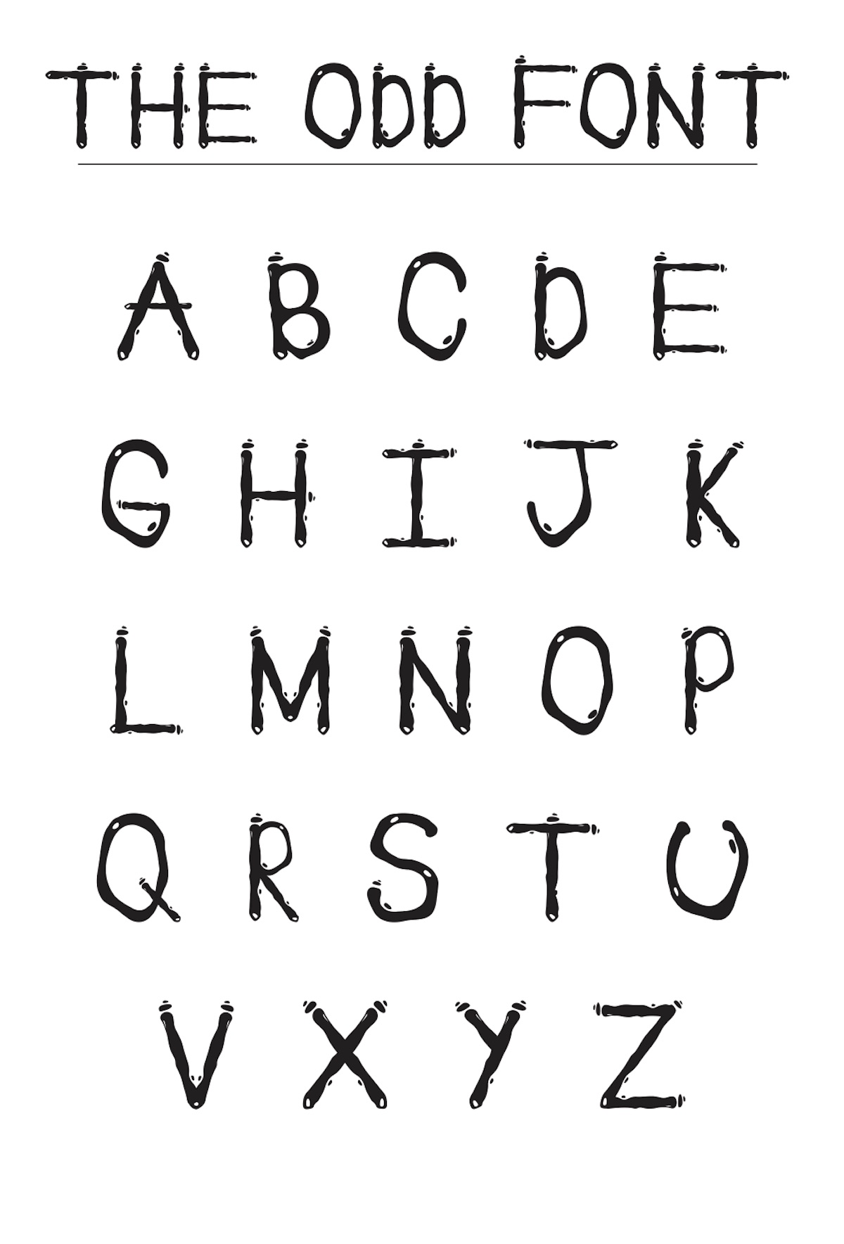
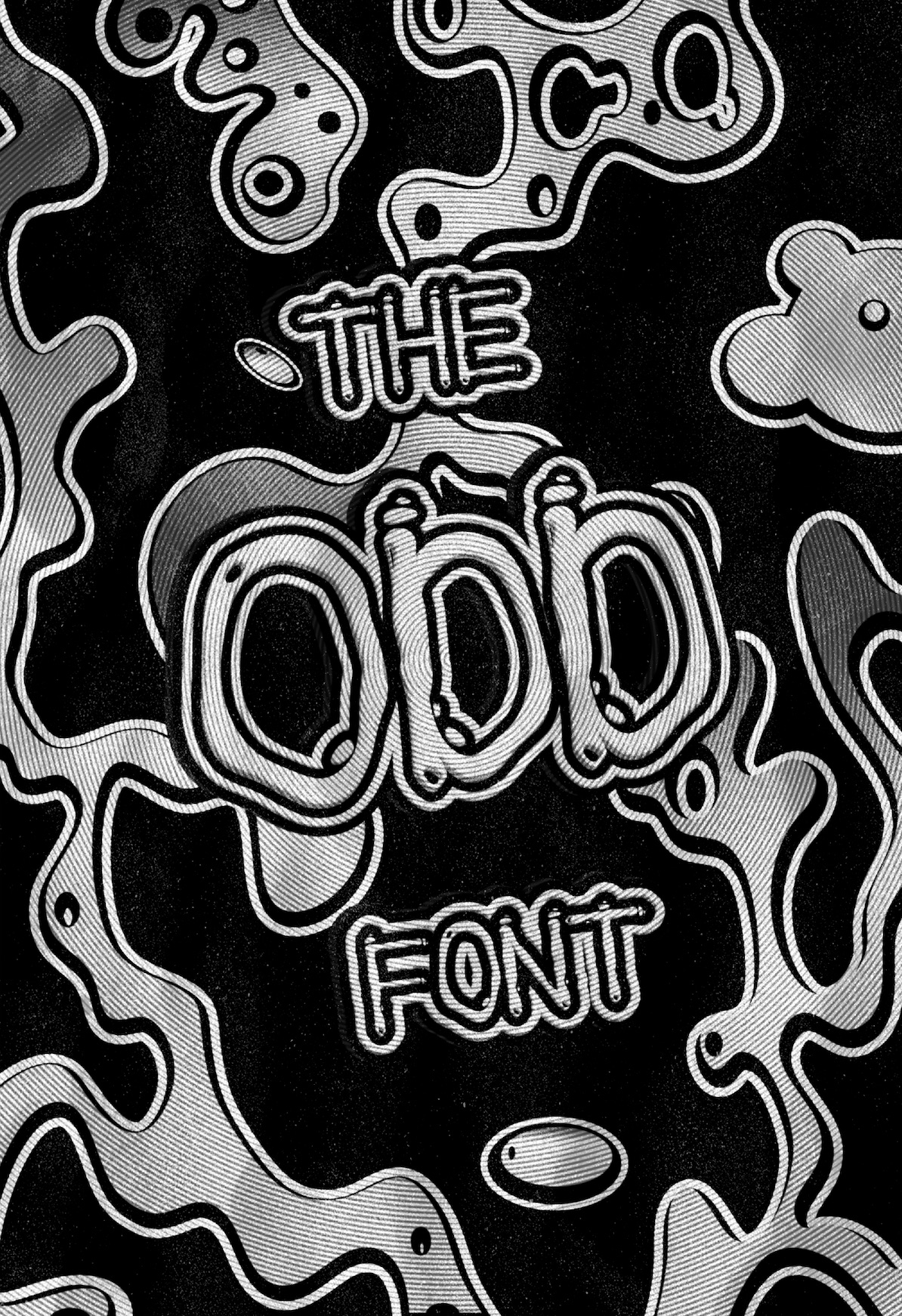
Font and Specimen Poster
Students design a 26-character typeface from a chosen theme, develop it through Illustrator and FontLab, then use a specimen poster to show how the system behaves at display scale.
Selected outcomes
02
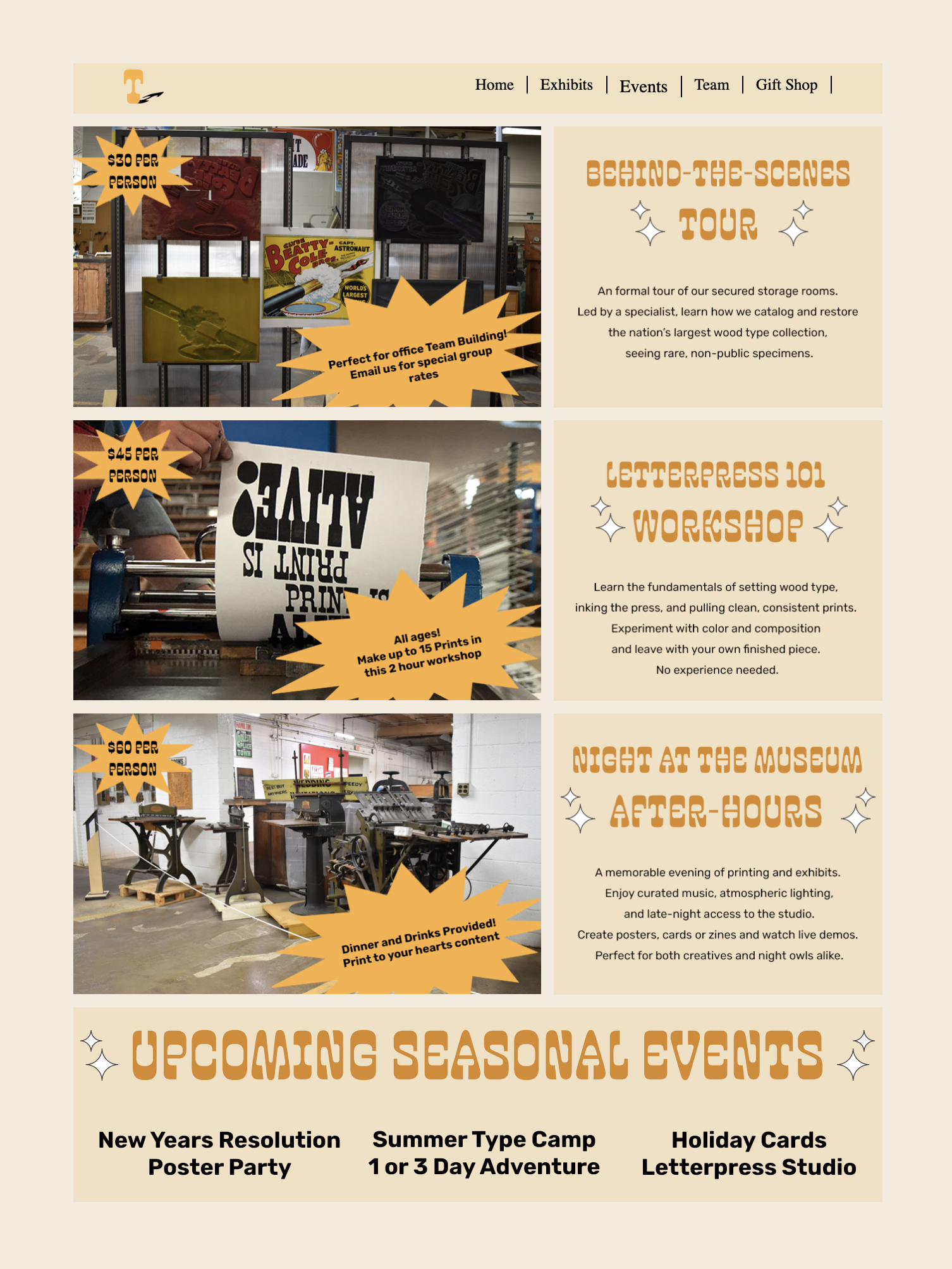
Logotype, packaging, motion
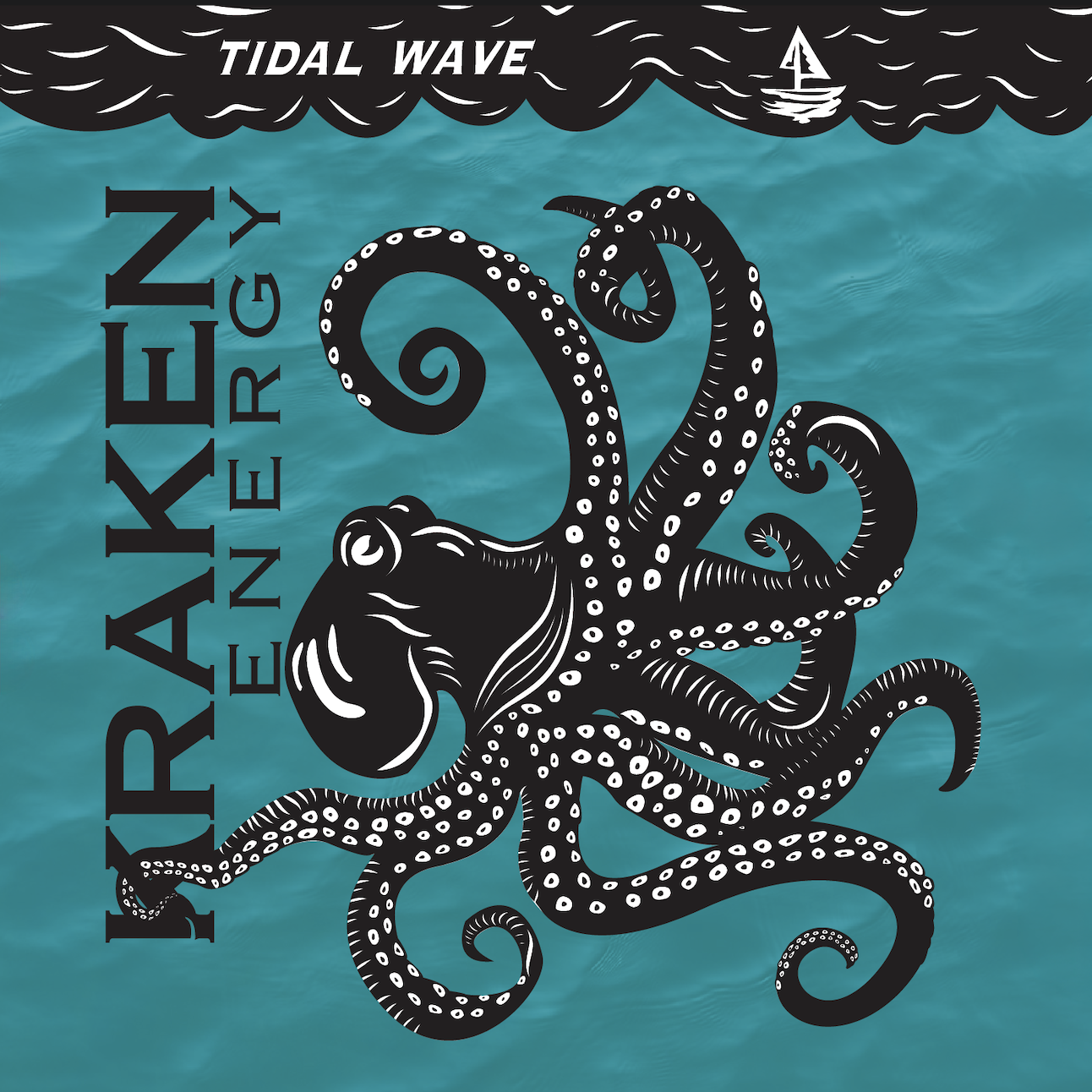
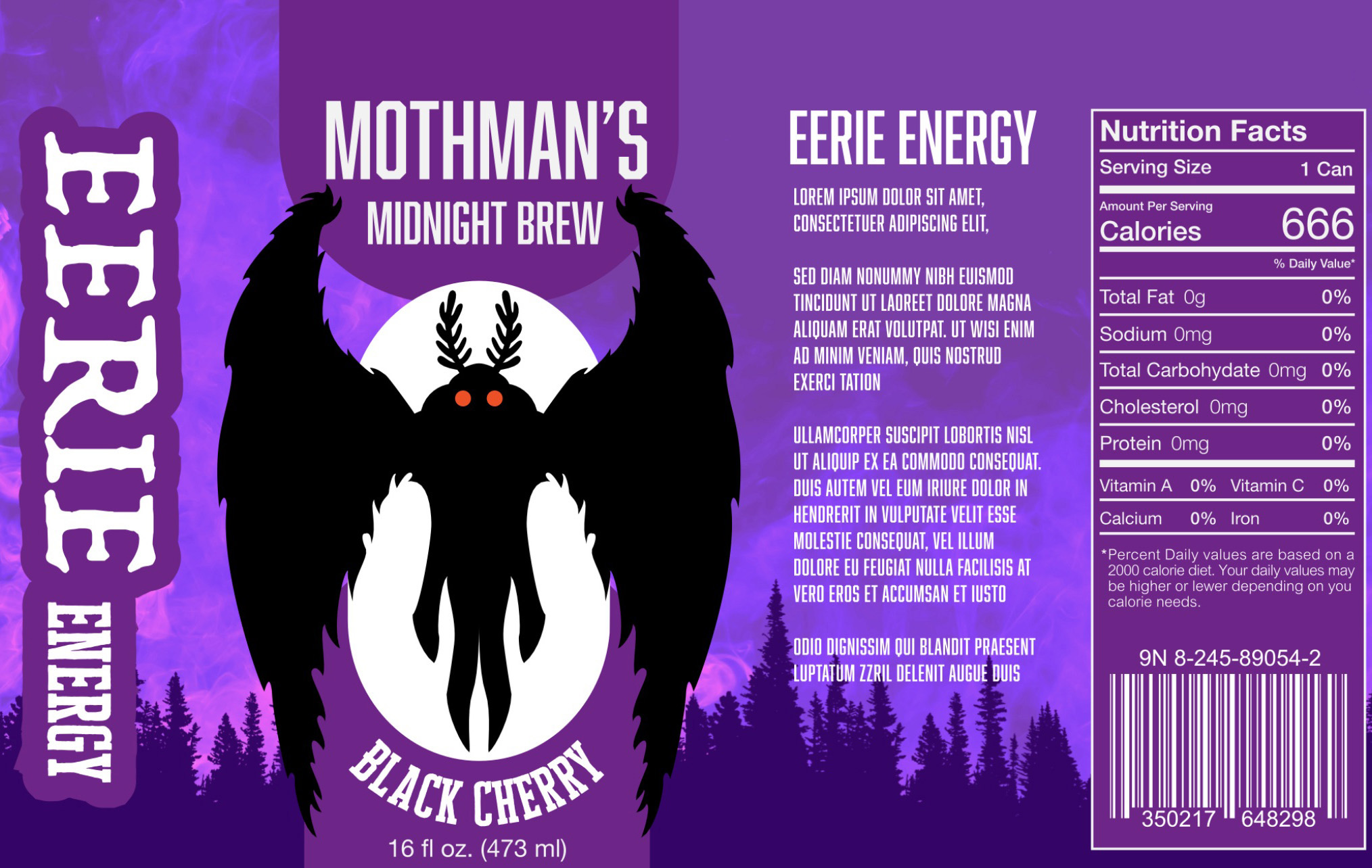
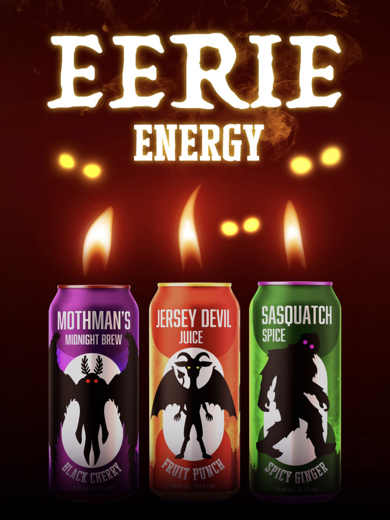
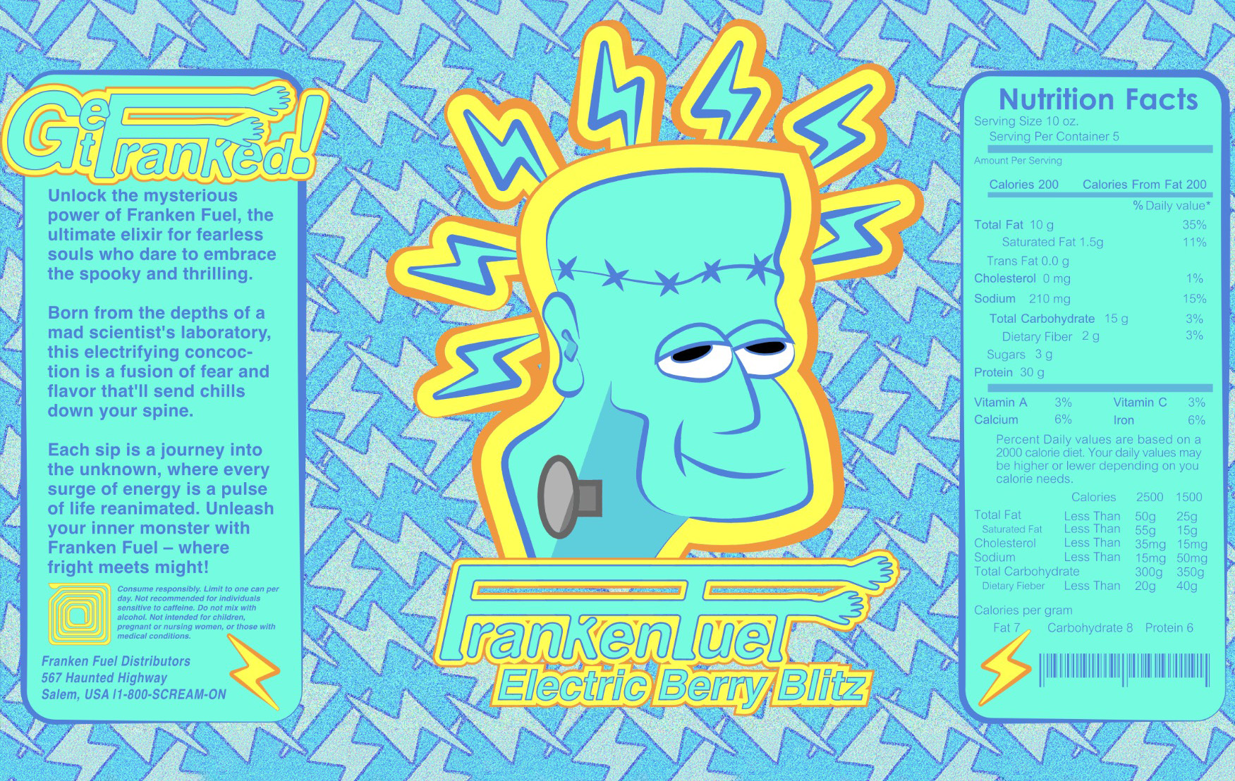
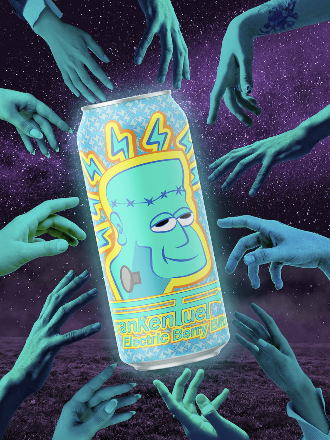
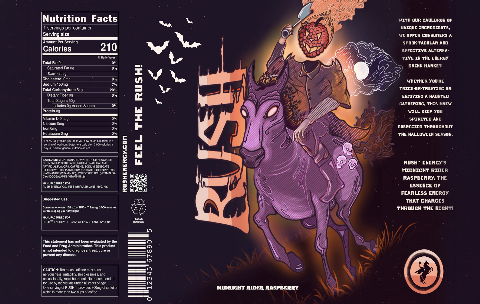
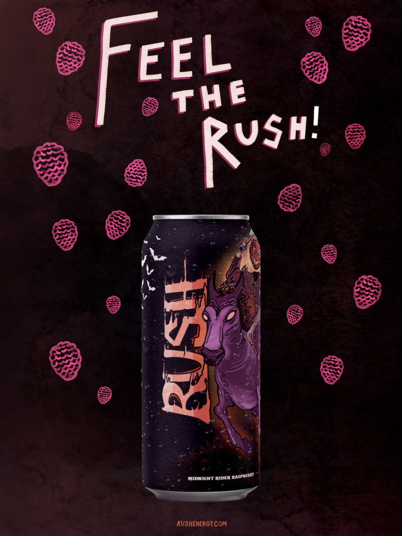
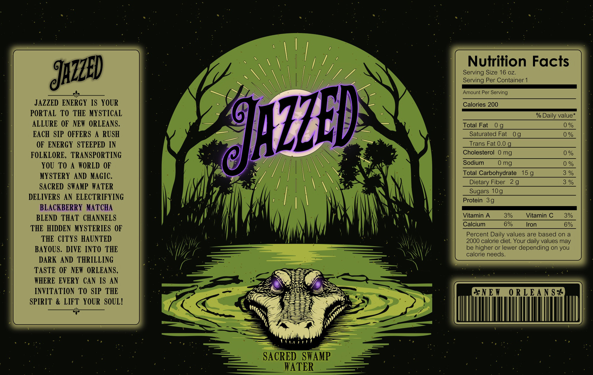
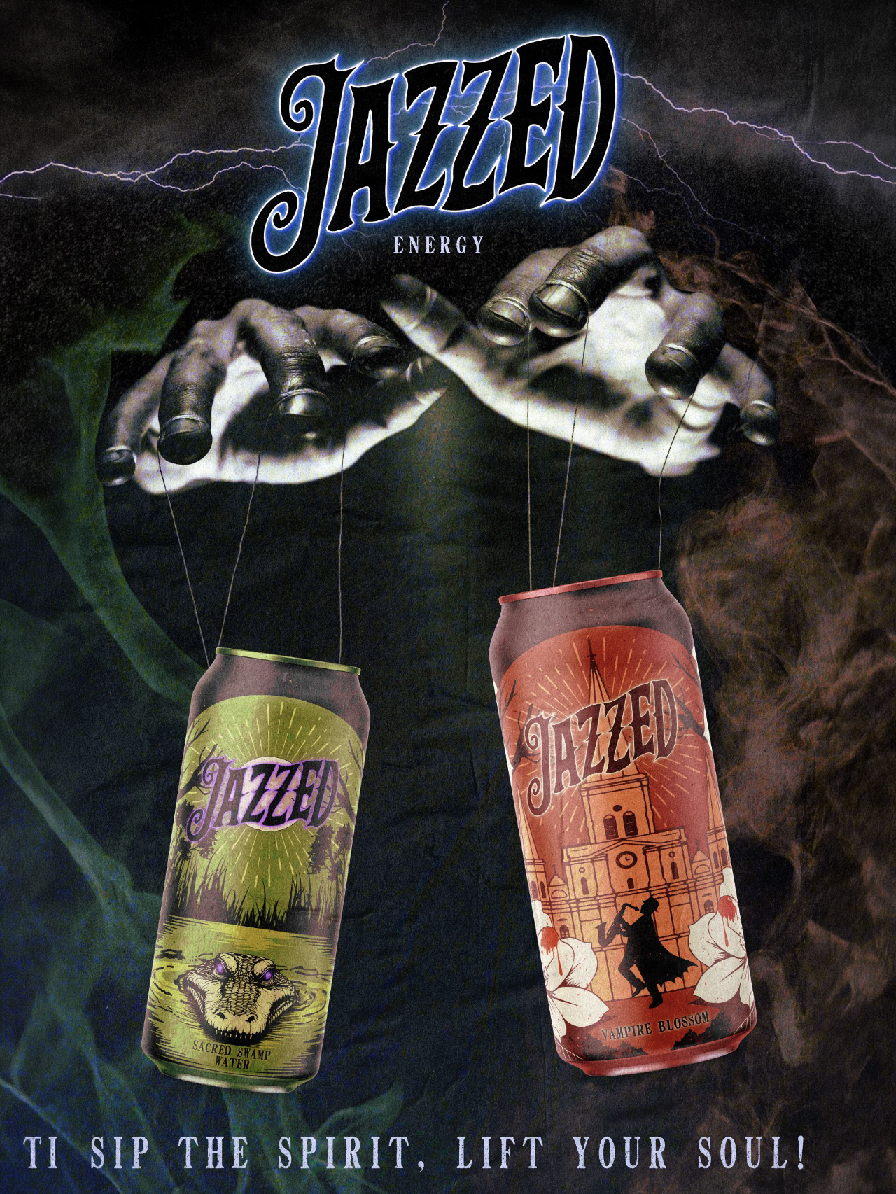
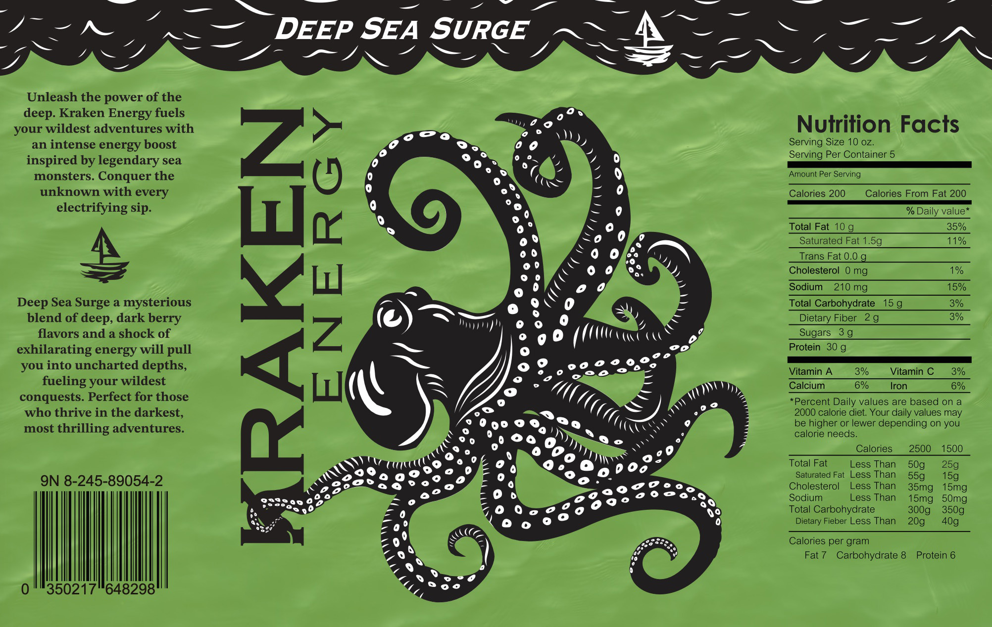
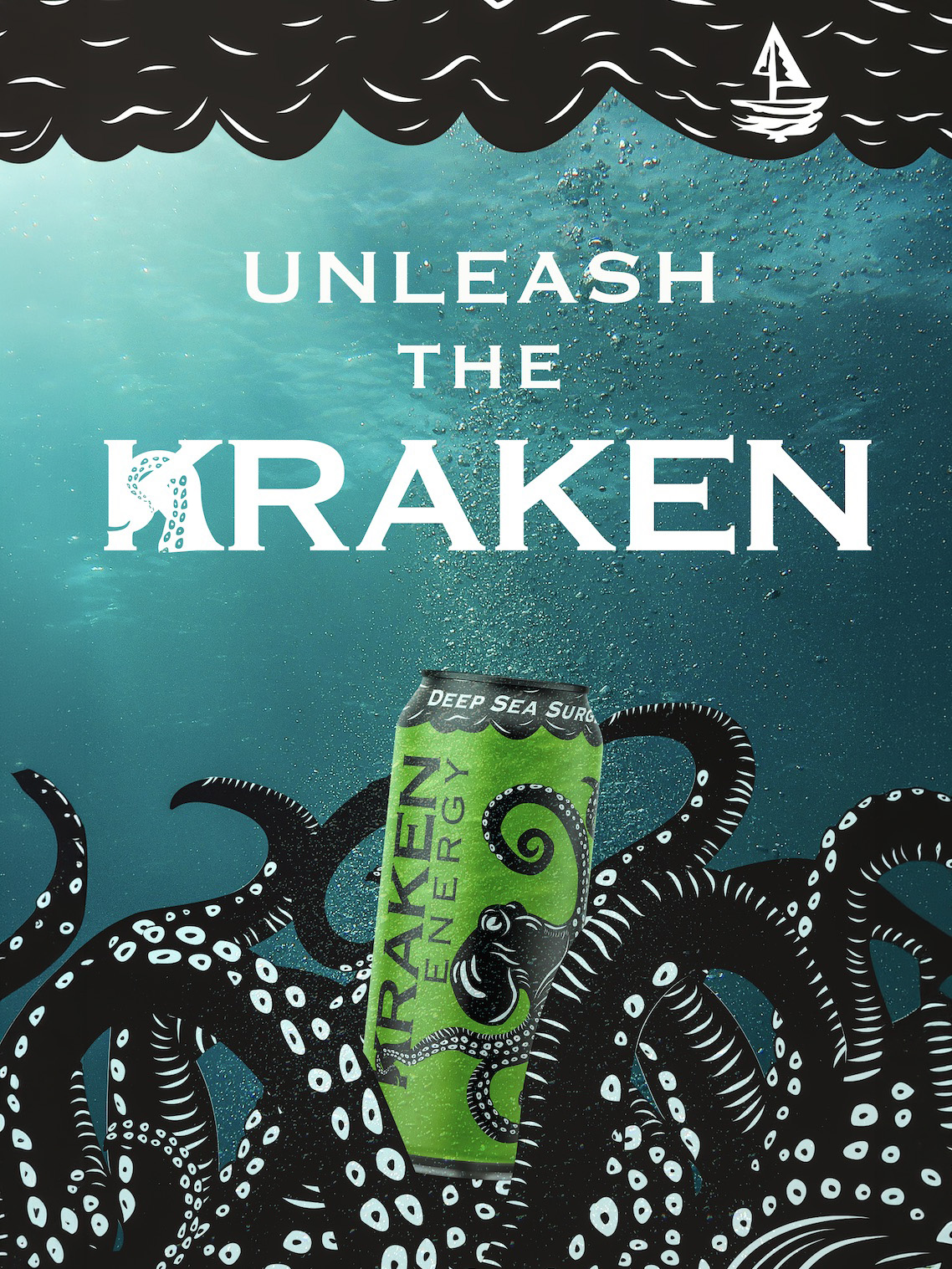
Fonts of Fright
Students create Halloween-themed energy drink labels, a Photoshop poster scene, and a short After Effects motion graphic. The project connects typographic voice, brand hierarchy, and time-based presentation.
Selected outcomes
03
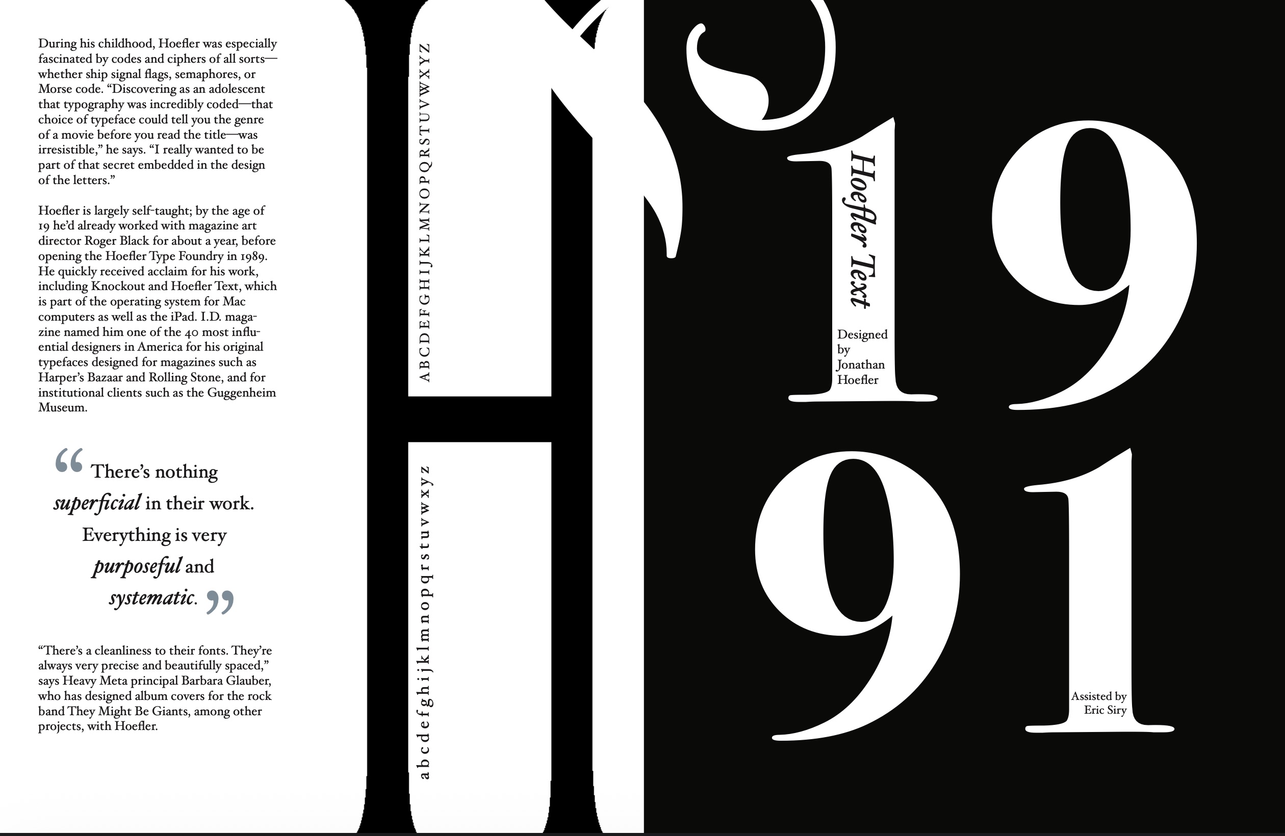
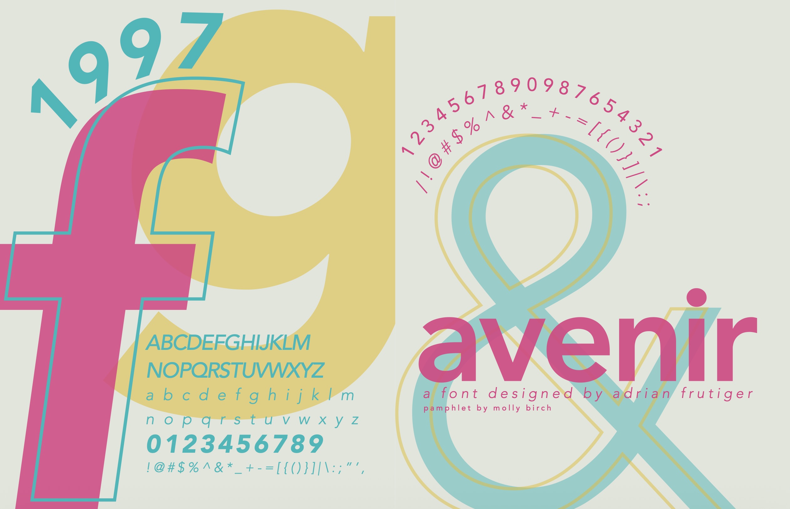
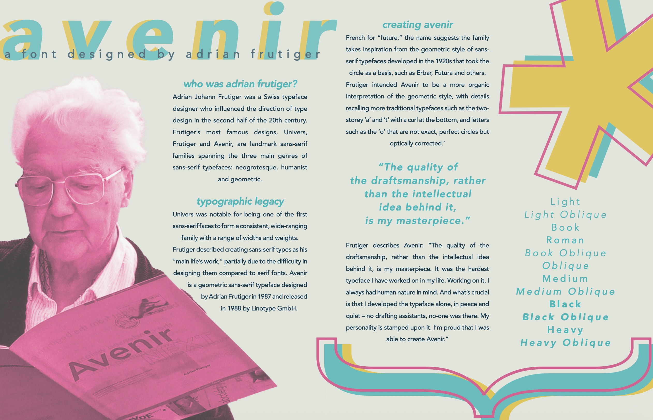
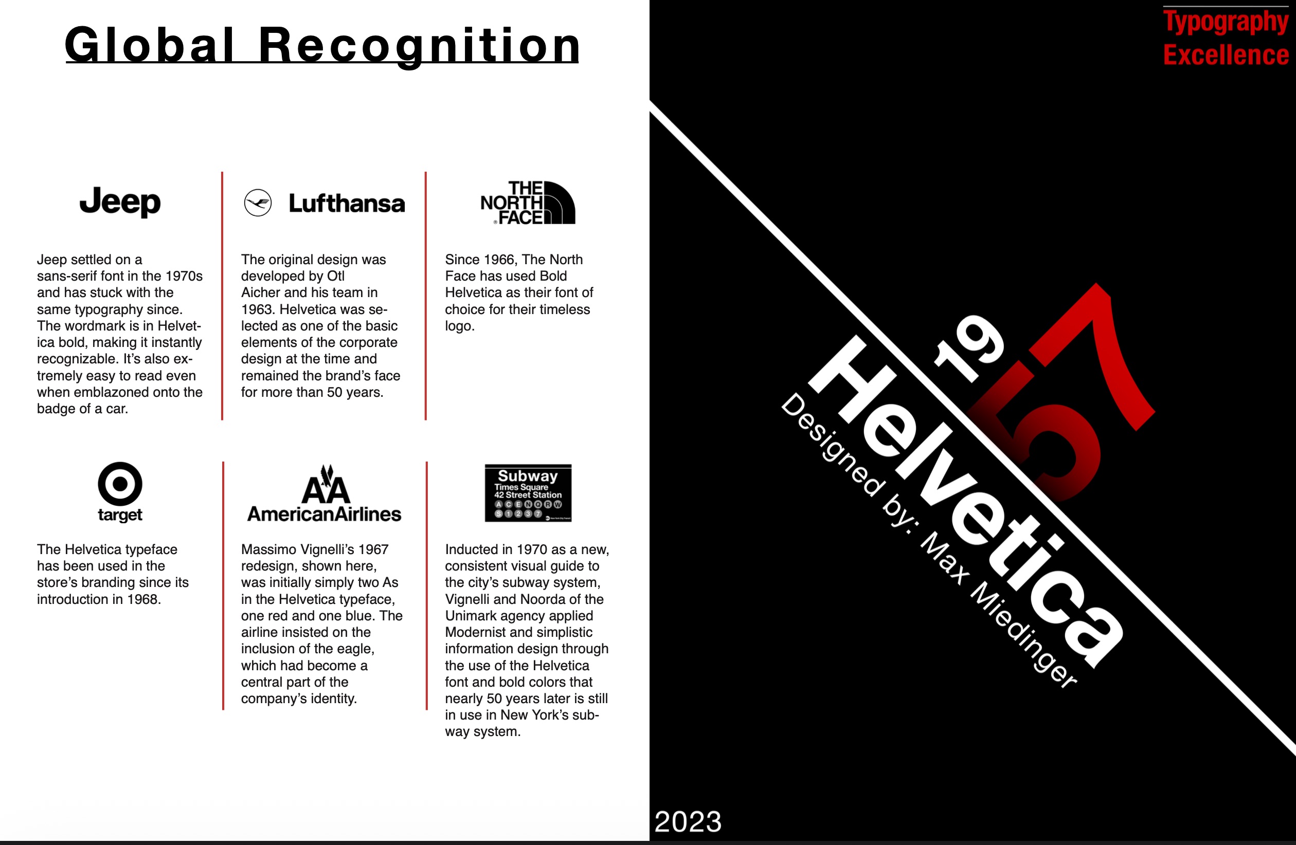
Research, grid, pamphlet
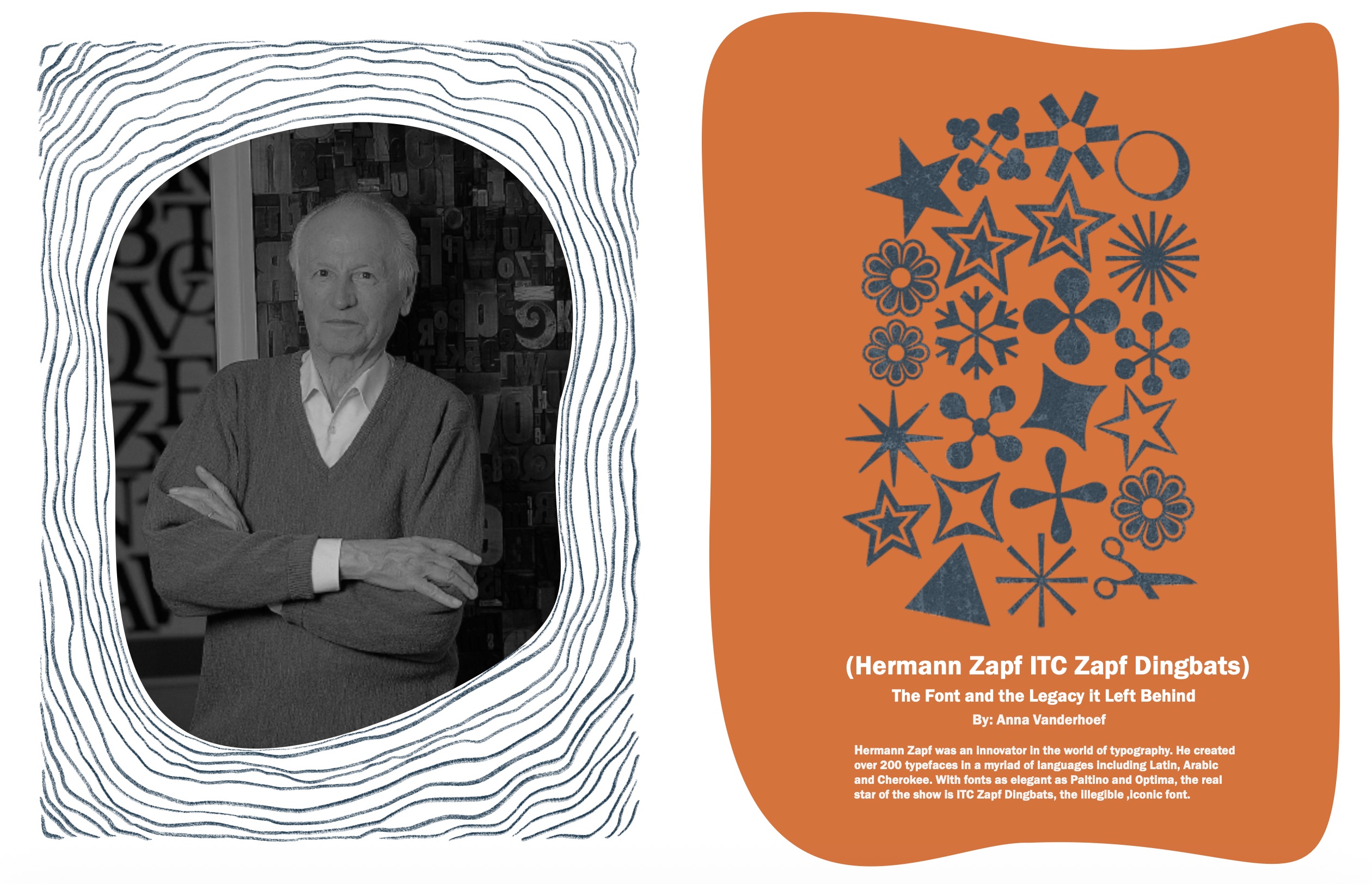
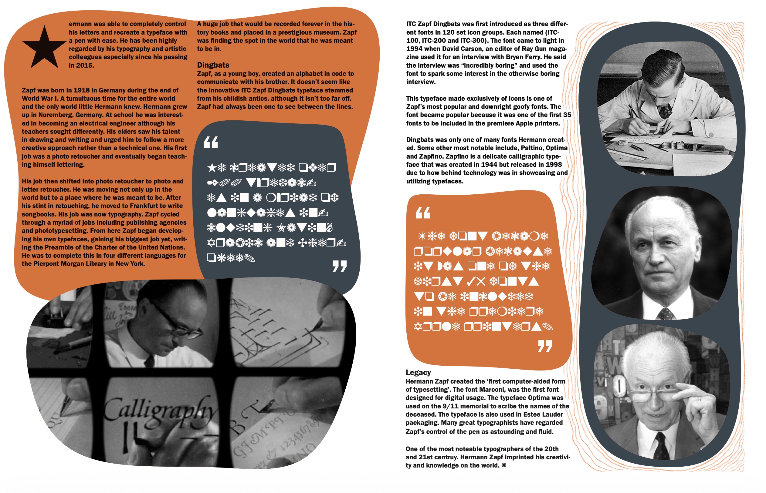
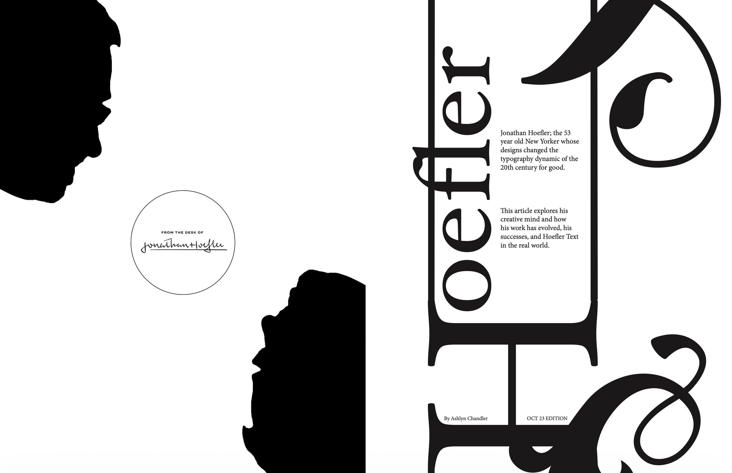
Typographic Legacies
Students research an influential typographer or typeface, then build a multi-page pamphlet in InDesign that uses grid, sequence, imagery, and written context to interpret that legacy.
Selected outcomes
04
HTML/CSS, navigation, screen hierarchy
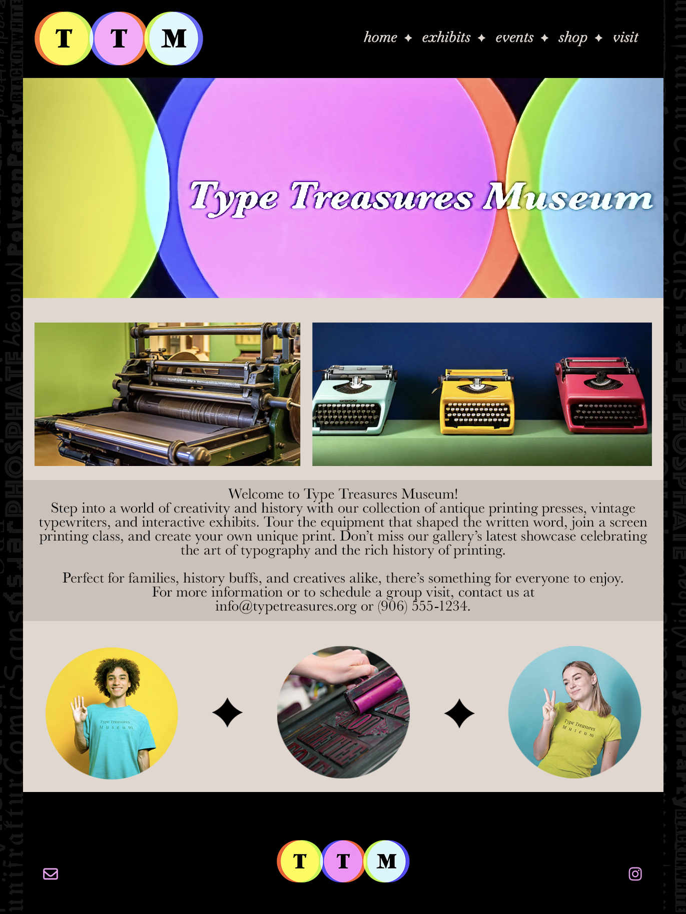
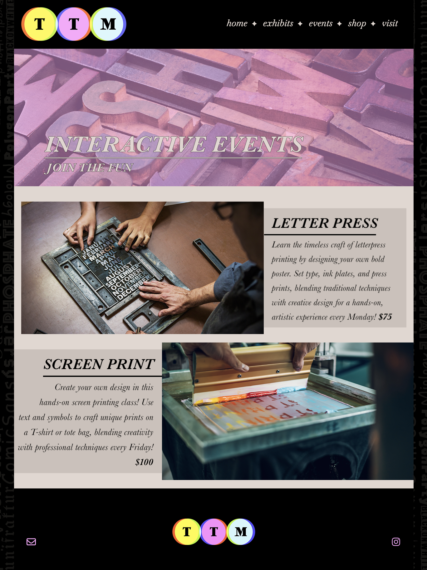
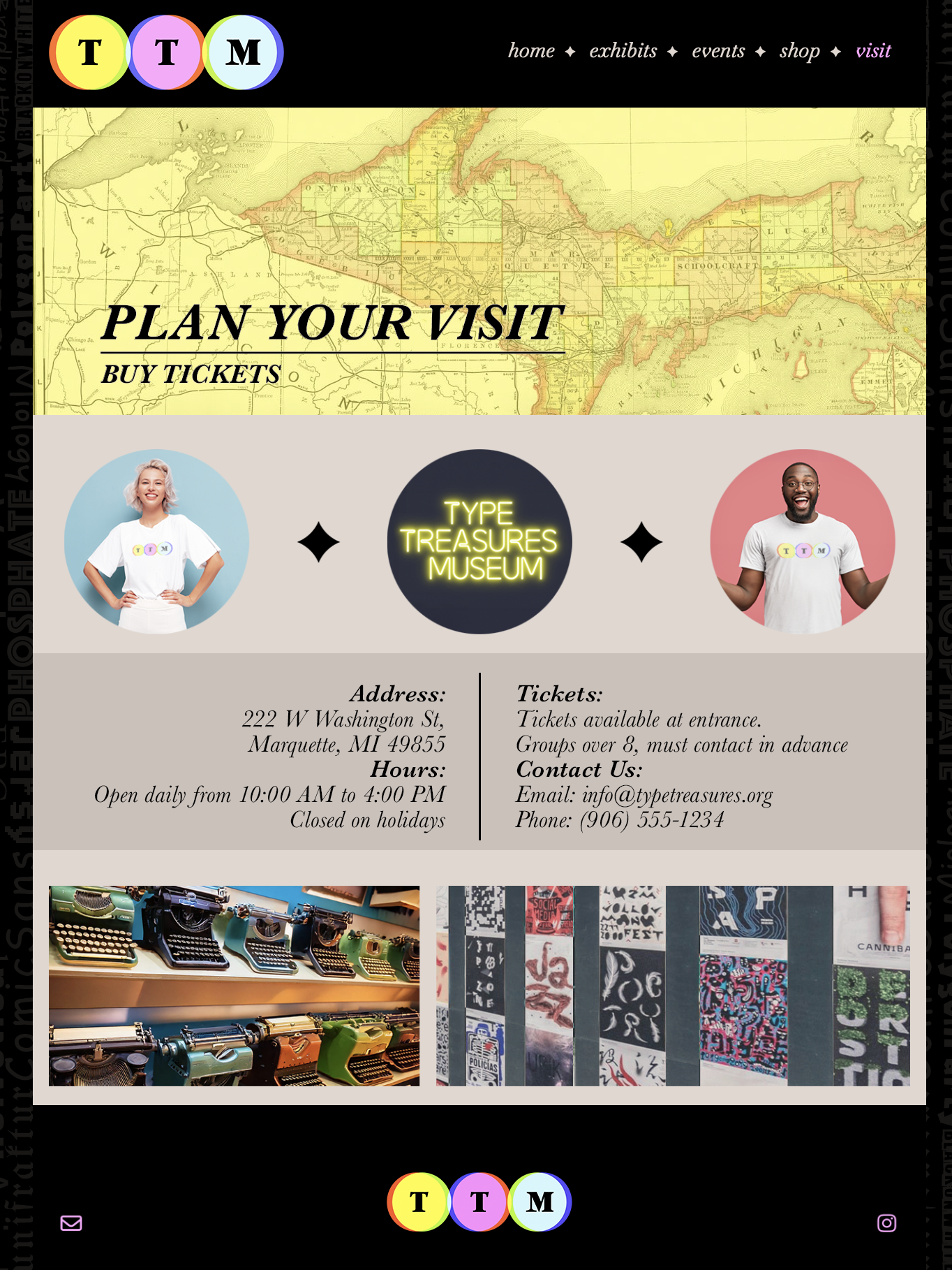
Website Typography
Students translate typographic hierarchy into a small five-page website. The project asks them to make type, navigation, imagery, and page systems work together across a branded screen experience.
Selected outcomes
Methods
How type decisions stay visible.
The course is structured around iterative studies, critique, and production checkpoints so students can explain why a typographic choice works and what should change next.
Process Proof
Sketches, type studies, drafts, and file preparation make the thinking visible before students move into finished typographic systems.
Critique for Readability
Feedback focuses on what the type is doing, where hierarchy breaks down, where pacing changes, and where tone supports or fights the message.
Tool Fluency
Software is treated as a production language. Students move between drawing, vector, raster, font production, layout, image editing, and motion with intent.